Museo Universitario Alejandro Rangel Hidalgo
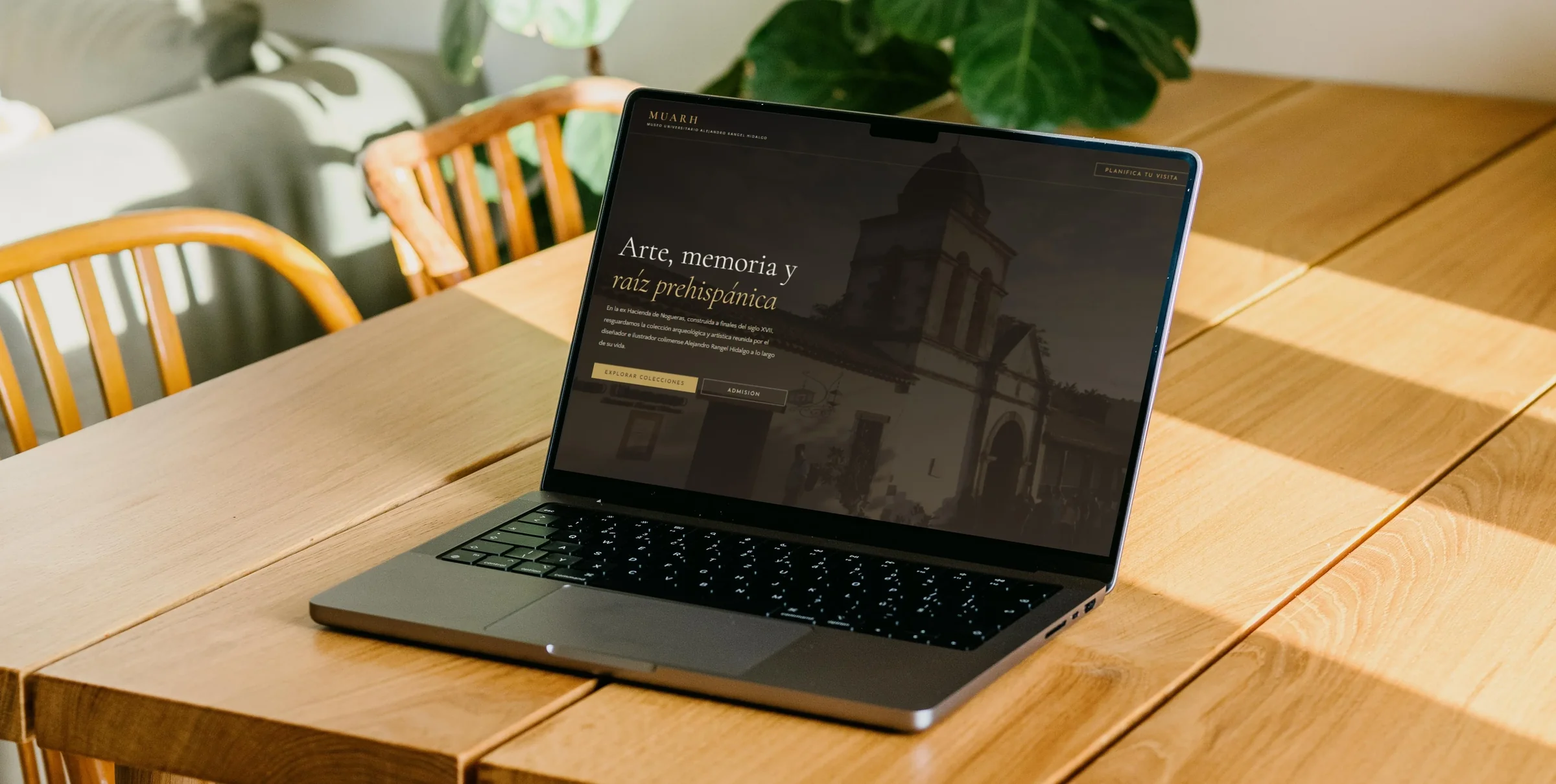
An accessible and responsive web platform designed to explore the Museo Universitario Alejandro Rangel Hidalgo’s four exhibition halls, consult visitor information, and book visits online.
Role
Frontend Developer and Accessibility Evaluator
Project Goal
Design and develop an accessible website for MUARH enabling all visitors to explore galleries, check admission fees, and book visits online, while empirically evaluating WCAG compliance with screen reader users.
Target Audience
Designed for all museum visitors, with particular focus on blind and low-vision users navigating via keyboard, NVDA (Desktop), or TalkBack (Android).
Key Challenges & Constraints
The primary challenge was embedding web accessibility into both UI design and frontend architecture, particularly across complex interactive components:
Evaluation Constraints: The usability study was conducted with 3 participants with visual impairments using Chrome with the NVDA screen reader on desktop and TalkBack in partial reading mode on Android.
Design Strategy
From initial development, I designed and developed the platform around the four core principles of WCAG 2.1 Level AA: Perceivable, Operable, Understandable, and Robust.
Key Implementation Strategies
Structure & Semantics
- Semantic HTML5: Landmark regions (header, nav, main, footer).
- Heading Hierarchy: Logical document heading sequence.
- Language Spec: Document lang attribute defined.
- ARIA Integration: Dynamic states & live updates.
Visual & Contrast
- Color Contrast: WCAG AA/AAA compliant text ratios.
- Alternative Text: Descriptive alt attributes for images.
- Responsive Design: Fluid adaptation across all devices.
Keyboard & Forms
- Keyboard Navigation: Logical tab order & focus rings.
- Accessible Forms: Explicit labels & instructions.
- Descriptive Labels: Clear button and link names.
Evaluation Conducted
The accessibility evaluation was structured across three complementary methodology stages:
Manual Inspection
Comprehensive code review evaluating document structure, contrast ratios, keyboard navigation, and ARIA control behavior against WCAG 2.1 AA.
Automated Scans
Automated evaluation using Lighthouse and Silktide to identify underlying technical issues related to HTML structure and contrast.
Live User Testing
We conducted qualitative usability testing sessions with 3 blind and low-vision participants navigating task scenarios via NVDA (Desktop) and TalkBack in partial reading mode (Android).
User Task Scenario
You are planning to visit the museum with a friend next Sunday, May 3rd, as you are both interested in seeing the pre-Hispanic ceramics gallery. Before leaving home, you decide to check the website to plan your schedule and calculate the budget for the visit.
- Find the admission price to enter the pre-Hispanic ceramics gallery.
- Book the visit to the ceramics gallery for two people for May 3, 2026.
Test Results & User Feedback
All three participants successfully completed the assigned task scenario (100% completion rate). However, testing nevertheless revealed key accessibility barriers in date selection, modal focus management, and form validation:
Additional Interaction Barriers
- Certain form controls failed to announce their active/checked states to the screen reader.
- Form validation errors were not communicated auditorily to screen reader users.
- Keyboard focus was not automatically redirected to input fields containing errors.
- The email address field was occasionally bypassed during keyboard navigation.
- The numeric input field for selecting visitor count proved cumbersome to operate.
- The navigation link labeled "Recorridos" (Tours) did not clearly communicate that it led to admission pricing.
Positive User Feedback
Participants highlighted the comfortable visual contrast ratios, the Dark Mode adaptability, and the clear typography structure across the platform.
Final Design & Improvements
The final outcome was a responsive and accessible website that allows visitors to explore the museum’s galleries, find useful information, and book visits online.
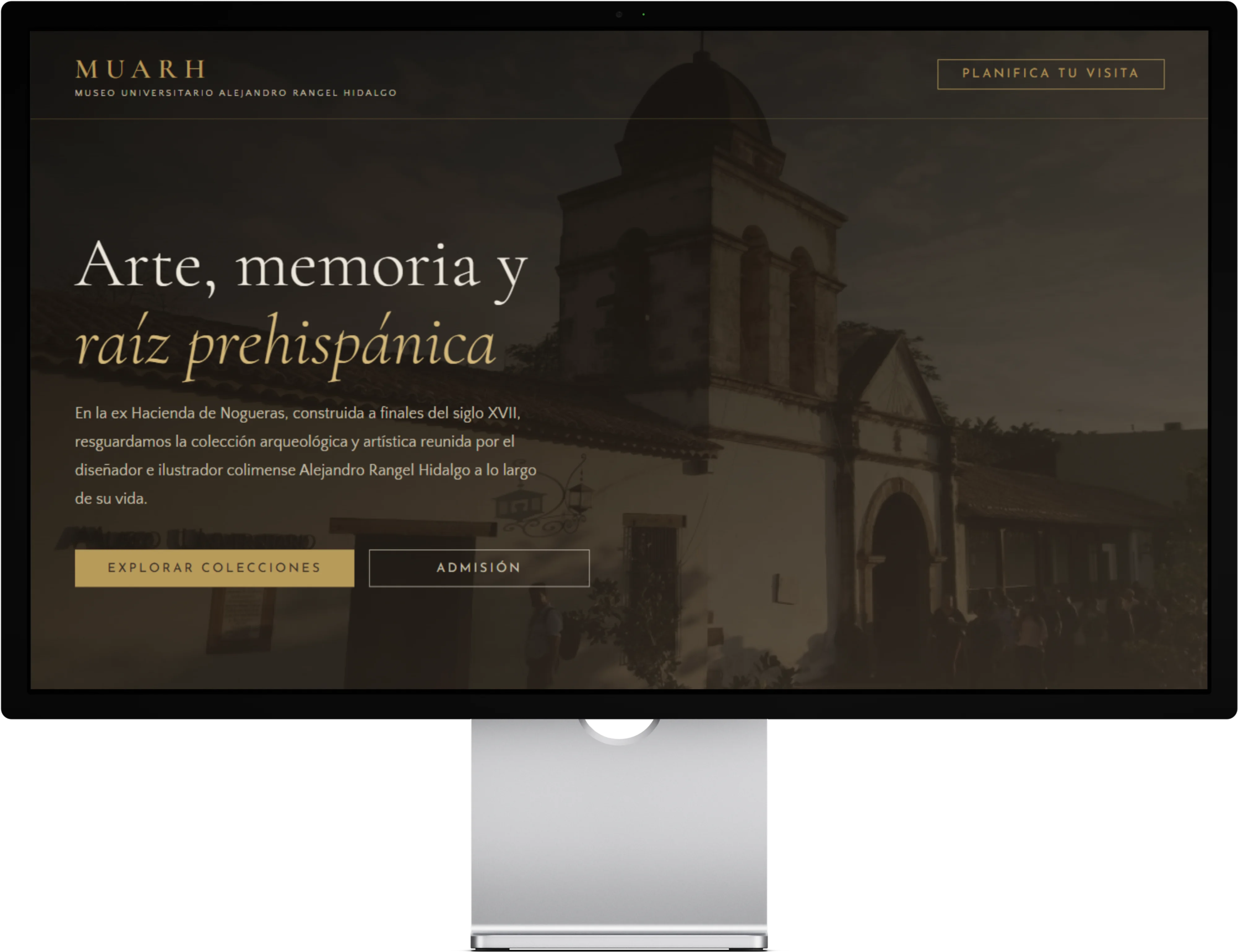
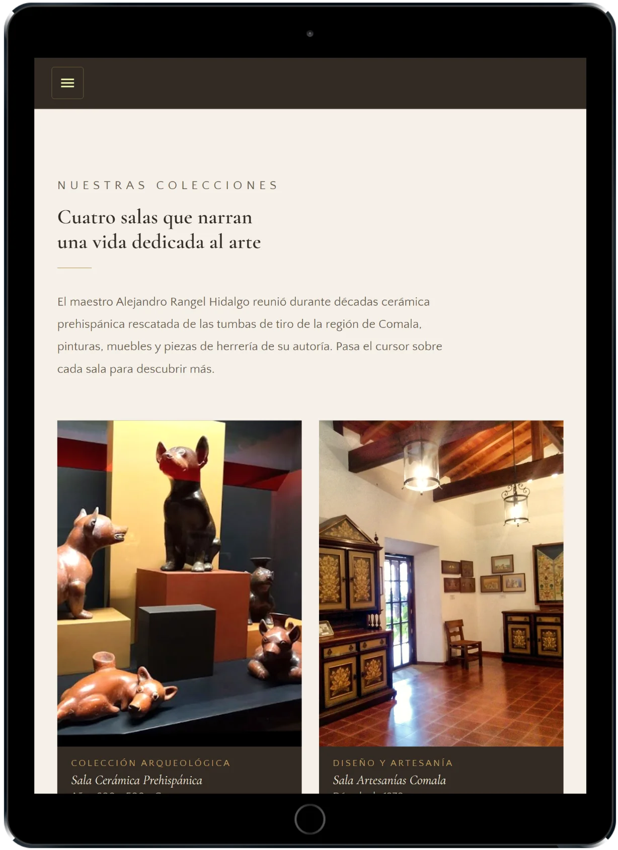
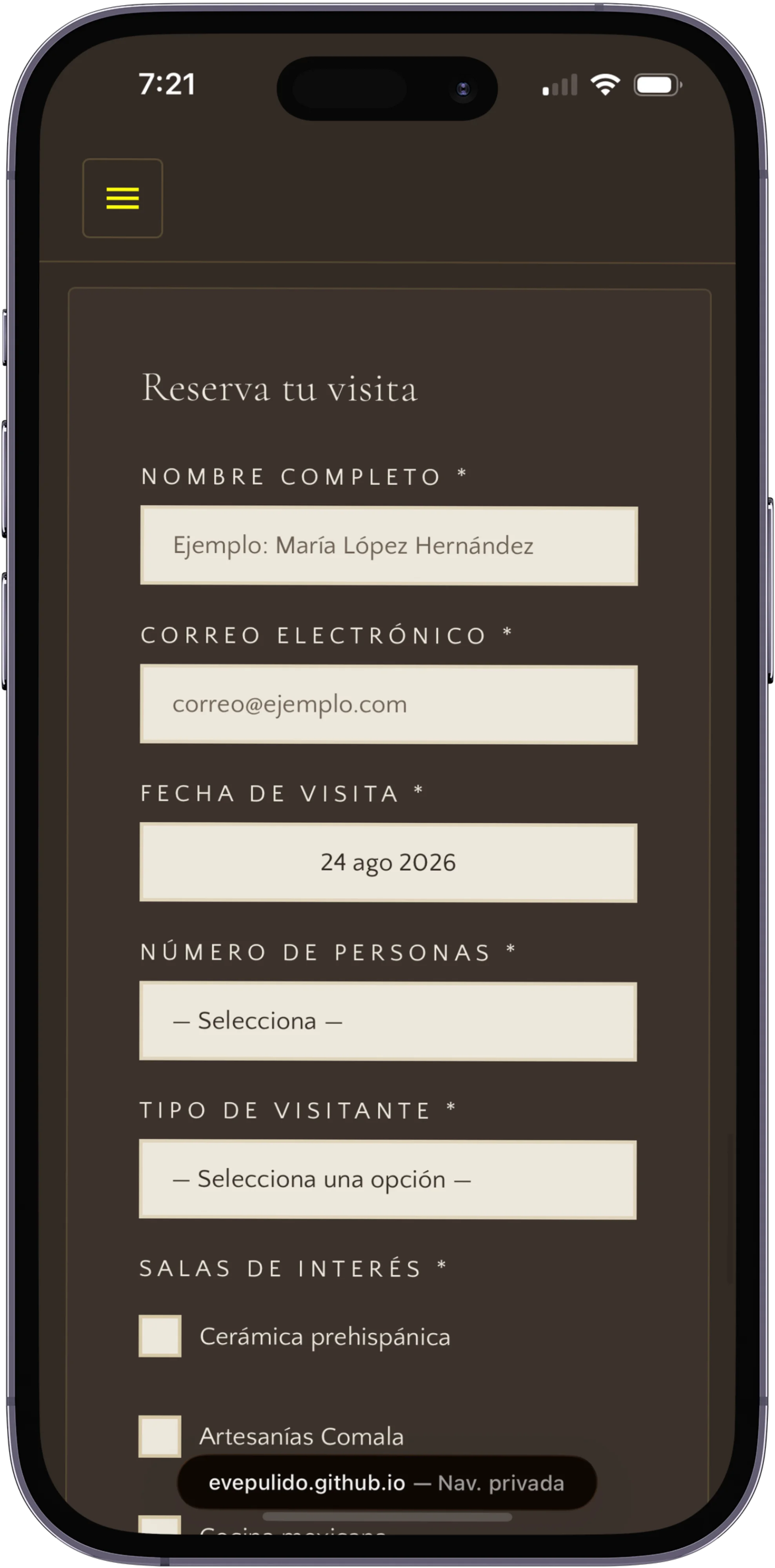
Based on the user testing findings, I implemented the following key interaction and code improvements across the platform:
Keyboard and screen reader accessibility
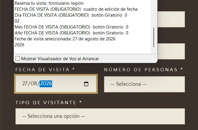
- Corrected the keyboard focus order in the date picker component.
- Added live screen reader announcements for selected dates and form validation errors.
- Improved keyboard focus trap management within modal overlay dialogs.
- Enabled closing modal dialogs via the Esc key.
Navigation and form usability
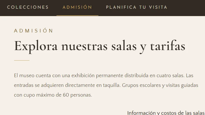
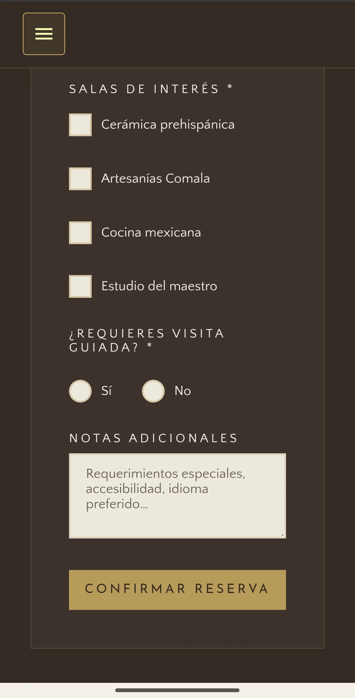
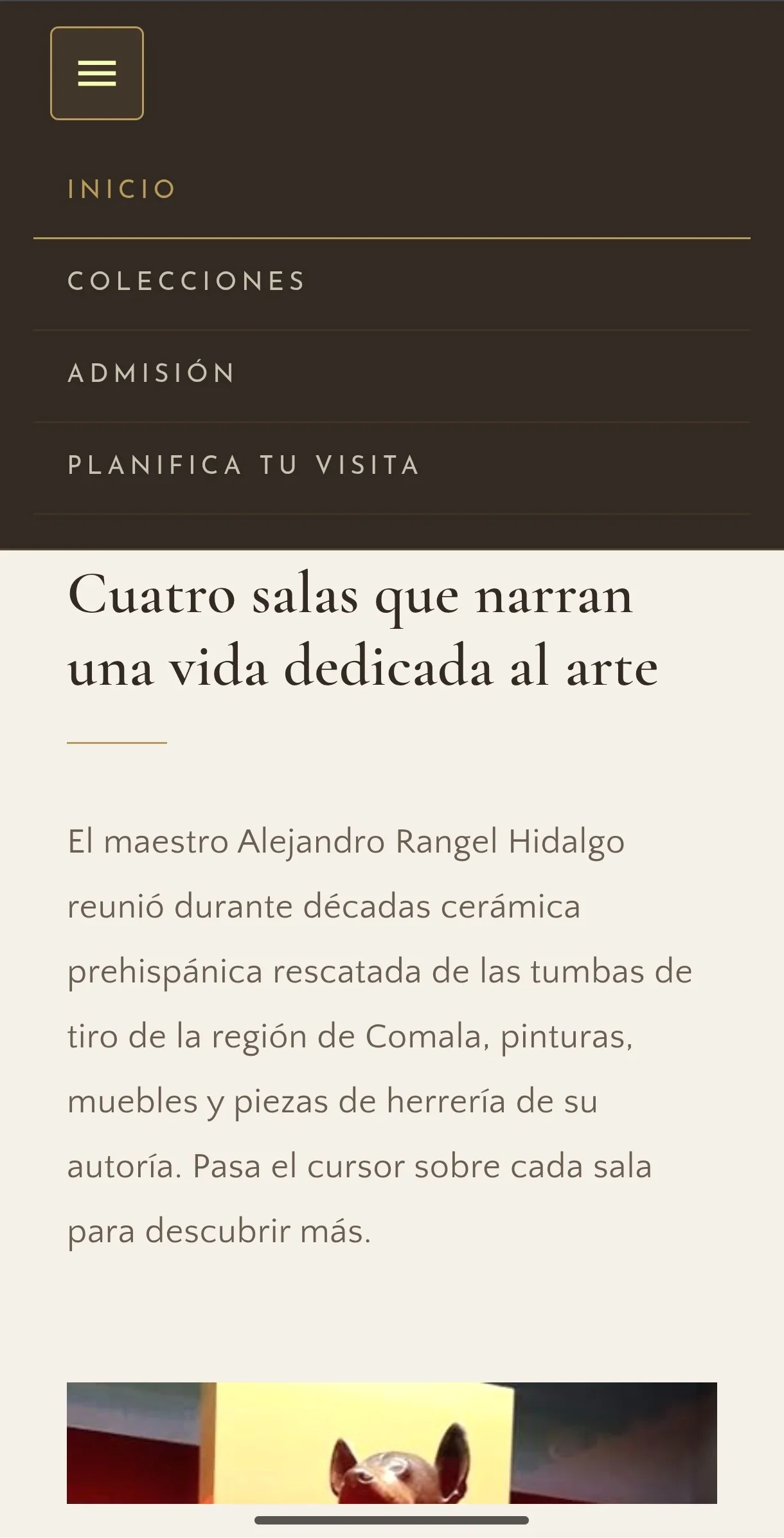
- Updated navigation labels, changing "Recorridos" to "Admisión" for clarity.
- Simplified the input control for selecting the number of visitors.
Mobile accessibility
- Increased touch target sizes to meet minimum height recommendations for TalkBack and VoiceOver.
- Configured controls to announce active states ("checked" or "unchecked") when toggled.
- Improved touch spacing to prevent misclicks during mobile swipe navigation.
Key Learnings
Developing and evaluating MUARH demonstrated how web accessibility principles can be integrated into frontend development and verified through live screen reader testing.
Core Learning: Manual code inspections and automated scans (such as Lighthouse and Silktide) establish essential technical baselines, but they cannot replace direct testing with screen reader users. Although all 3 participants completed the task scenario (100% completion rate), observing their live interactions revealed critical barriers in keyboard focus order, state announcements, and modal controls that led directly to code improvements.
The evaluation confirmed that accessibility is a continuous process of technical implementation, empirical testing, and iterative improvement.